Our Labeling Process: The Finishing Touch to an Organized House
- Michelle Urban
- Oct 21, 2025
- 9 min read

Updated: Oct 24, 2025
TL;DR
Brother P-touch Cube Plus (cheaper at The Container Store)
Tape Color
Atlanta font
Size 22
All caps
Double-spaced letter and triple-space between words
One category per label keeps things simple and consistent
If you’ve ever gone down a labeling rabbit hole, you know how quickly it can spiral. Fonts, colors, tapes, and icons start piling up until your “minimalist” pantry looks more like a craft store display. What started as a small project now feels like a part-time job. At The Organized House, our goal is the opposite: labels that quietly guide, not compete. We want systems that feel calm, intuitive, and easy to maintain long after the project is done.
We get asked all the time about our labeling process. What we use, how we format it, and why it just looks right. Labels can so easily add visual clutter if they’re too bold or busy. Ours are meant to do the opposite: to blend in, guide you subtly, and make your systems intuitive without shouting for attention.
Why We Label (and Sometimes Don’t)
Labeling is all about clarity. It gives every bin, drawer, and shelf a clear identity so your brain doesn’t have to do the guesswork. It’s especially helpful in shared spaces — kitchens, playrooms, pantries, garages — where multiple people need to know what belongs where.
That said, not everything needs a label.

Sometimes the design or layout of a space is intuitive enough that a label would only distract. If the contents are in an open bin and clearly visible, you may not need a label at all. Another example is a row of matching cereal containers — you don’t need “Cereal” printed on each one; it’s already obvious. But for opaque bins, drawers, or anything tucked out of sight, a label saves time and helps everyone know exactly what belongs where.
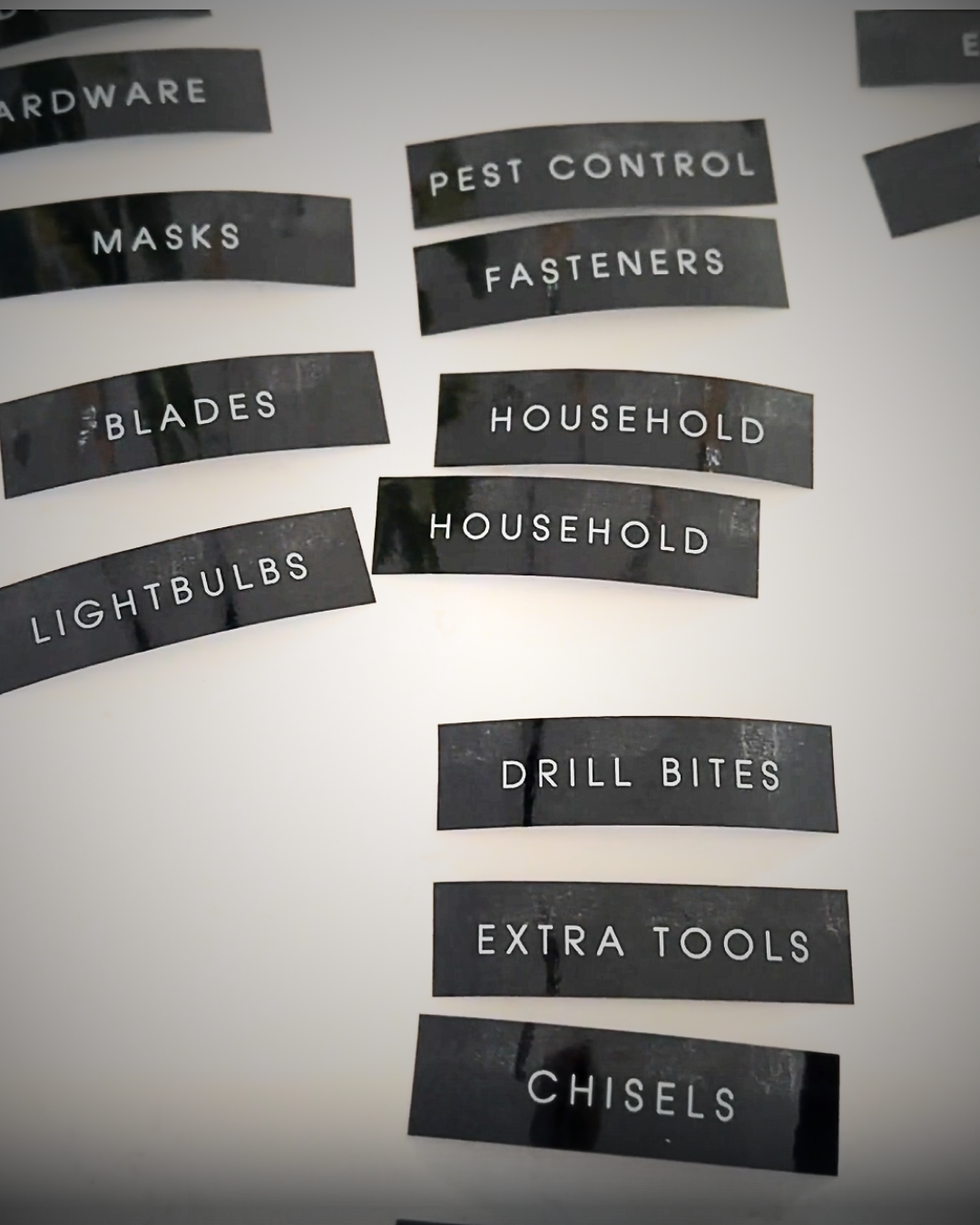
One Category per Label
We follow a “one category per label” rule. It’s tempting to list every single thing that lives in a bin — light bulbs, extension cords, batteries, tape — but that creates visual noise.

Our brains are wired to process visual information quickly. When your eyes have to stop to read multiple words, your brain goes through a tiny back-and-forth of decoding rather than recognizing. It’s mental clutter. It's subtle, but very real. Fewer words mean faster recognition and less fatigue.
If you find yourself wanting multiple labels on one bin, it’s often a sign that the bin is doing too much. Try dividing the contents instead.
At TOH, we’d rather have more smaller bins with fewer items than one oversized bin that holds everything. It keeps things easier to find, easier to put away, and visually calmer.
For example, in a garage you might have ant traps, hornet spray, mouse traps, and fly tape. Instead of labeling each one individually, we’d use a single label: PEST CONTROL
If that still feels too broad, break it down into two bins with a more specific category:
INSECT REPELLENT (ant traps, hornet spray, fly tape)
RODENT TRAPS (mouse traps, bait)
We use this same approach for art supplies, too. Instead of one big bin labeled Art Supplies with sublabels for markers, crayons, glue, paper, and scissors, we’d break it into smaller, single-category bins like DRAWING, CRAFTING, or PAINTING. It’s faster for everyone to grab what they need and easier to put things back. And if you have a lot of one type of item — say, markers — you can dedicate a single bin labeled MARKERS and store all the different types together in one place.

Tip:If you’re tempted to list every item on a bin, step back and simplify. Your goal is quick recognition, not a full inventory. The simpler the label, the faster your brain connects what belongs there — and the better the system holds up over time.
Our Go-To Label Maker
We use the Brother P-touch Cube Plus for nearly every project. It’s reliable, Bluetooth-enabled, and connects to your phone, which makes labeling on the go (or in the middle of a garage install) super easy. You can buy the Brother P‑touch Cube Plus at several retailers, and The Container Store usually has one of the best prices.

Pros
Compact and easy to carry between projects
Consistent, professional-looking print quality
Connects to your phone through Bluetooth
The app allows for custom fonts, spacing, and alignment
Cons
Brother Label tape is harder to find lately - we use a generic brand
The tape auto-cuts after each label, which can waste material
Slower print speed when making long or multiple labels
Battery life is short — better to plug it in for longer sessions
Tape Type: Color, Size, and When to Use Each
We use 24 mm (1 inch) label tape about 85 percent of the time because it’s the sweet spot for readability without adding visual bulk. It’s wide enough that the text feels clear and substantial, but not so thick that it starts to dominate the bin.
For smaller spaces — like file folders, drawer fronts, or narrow shelving — we’ll switch to 12 mm or 18 mm tape (and decrease the font size). These sizes keep proportions balanced so the label feels intentional rather than bulky. For extra-large bins or anything viewed from a distance, we’ll use 36 mm tape. The larger scale keeps the text visible without increasing the font size too much.

Choosing the right tape size is about proportion. Labels should feel like part of the system, not decoration on top of it. The goal is for the label to guide your eye, not grab it.
Clear tape with black ink: Our favorite for acrylic, glass, or transparent bins. It looks seamless and blends into the background — almost like the words were printed directly on the surface. However, clear tape doesn’t read well on dark or textured bins. The black ink can disappear or look shadowed depending on the lighting.
White tape with black ink: This is our go-to for white bins or low-light areas. It gives just enough contrast to stay readable without being harsh. That said, white-on-black can sometimes feel too stark — it’s crisp, but on black bins it can start to feel “label-first” rather than “system-first.”
Black tape with white ink: We use this one often. It’s great for dark bins, metal surfaces, or anywhere you want the label to stand out just enough without shouting. Black tape with white ink has a more polished, modern feel and photographs beautifully in bright spaces.
When choosing tape, step back and look at how the label color and bin color work together visually. You want the words to appear naturally, not pop like a price tag. The best label disappears into the system — you notice the clarity, not the contrast.
Font Type: Atlanta
Atlanta is our default. It's a sans-serif typeface that’s clean, geometric, and slightly condensed. It has a modern structure with uniform strokes and subtle rounding that softens the look without losing clarity. It’s approachable, easy to read, and feels balanced — which is exactly how we want our spaces to feel.
Atlanta is built from simple geometric shapes, which means the letters stay crisp and consistent even when printed small. There’s no decorative flair or uneven weight — just clean lines that feel intentional and calm.
Font Size
Our standard font size is 22. It’s big enough to read easily but small enough to stay discreet. If we’re labeling oversized bins or storage containers that are viewed from farther away, we’ll bump it up. On the other hand, for smaller bins, drawers, or file folders, we’ll drop down to 16 (or smaller), especially if the word itself is long.
This part gets tricky and a little time-consuming — because label length isn’t just about font size.
Tape Length: Keeping It Consistent
We plan out the longest word first to determine how long each strip of tape should be. Everything else gets adjusted to match that length, so the labels align perfectly when applied side by side. We never want to cut with scissors. It keeps the look clean and uniform, avoiding the uneven, patchy feel that can occur when labels are of different lengths.
For example:
If your longest word is “BAKING SUPPLIES”, we’ll print that first, measure the tape length, and then make sure shorter categories like “FLOUR” or “SUGAR” have the same tape width.
The challenge is that we don’t want labels stretching five or six inches across a small bin — that’s where we might rename or simplify categories. Instead of “BACKSTOCK CLEANING SUPPLIES,” we might shorten it to “CLEANING REFILLS” or “CLEANING EXTRAS.”
At times, we use ChatGPT to help brainstorm simpler, cleaner label names that still make sense for everyday use.
All Caps, Always
Yes, all caps. It’s not about shouting — it’s about simplicity. Using all caps eliminates the endless “do I capitalize this or not?” debate, keeps spacing consistent, and just looks clean across every bin and surface.
Spacing: The Secret Ingredient
We double-space each character and triple-space between words. It gives the letters breathing room — and visually, it’s the difference between “labeling” and “designing.”

Here’s what that looks like:
Standard label: Pantry Snacks
Our label style: P A N T R Y S N A C K S
That little extra spacing makes each label easier to read from a distance and gives the same sense of calm that we aim for in the spaces themselves.
Blending Styles: Handwritten + P-touch
Not every space needs the same type of label. We often blend styles depending on whether a zone is permanent or flexible.

For long-term systems — like garages, laundry rooms, or utility closets — we use our P-touch Cube labels. They’re clean, consistent, and hold up perfectly over time.
But for zones that change more frequently, handwritten labels are sometimes the better choice. Pantires, kids’ spaces, hobby areas, or seasonal storage often evolve, and a printed label can start to feel outdated fast. In those cases, we use erasable label tags and a chalk marker or wet-erase pen.

It gives us flexibility to adjust categories without starting from scratch. And because the handwriting style contrasts softly with the structured P-touch look, it still feels intentional — a little personality layered into a clean system.
Tip: Use handwritten labels anywhere the contents are likely to rotate. Think toy bins, project drawers, or overflow zones. When that category shifts, a quick wipe and rewrite keeps everything up to date — no reprinting, no wasted tape
Pre-Printed Labels
We also use pre-printed labels for certain projects — especially when consistency and speed matter more than customization. Our go-to brand is Savvy & Sorted (waterproof and scratch-resistant). Their labels have a clean look, hold up well over time, and align with the overall minimalist aesthetic we love at TOH.

When we use them
Large-scale installs where dozens of bins need labeling fast
Spaces where clients want a uniform, polished look right away
Pantries or linen closets where common categories (like PASTA, SNACKS, CLEANING SUPPLIES) already fit the system
Pros
Consistent design and size
Fast and easy to apply
Durable and moisture-resistant
Great for client projects when timelines are tight
Cons
Limited customization (you’re working with what’s printed)
Harder to edit or rename categories later
Can feel a little too “perfect” in dynamic zones that change often
We love using pre-printed labels when the system is set and stable — like pantries, garages, or linen closets. But for flexible areas, we’ll always go back to the P-touch or reusable styles so our clients can adapt as life does.
Why The Labeling Details Matter
Our labeling process isn’t about perfection — it’s about purpose. The right label makes it easier to find what you need, keep it where it belongs, and maintain systems long-term. A clean, consistent style helps your home feel cohesive, intentional, and — most importantly — effortless to live in.
When your labels have breathing room, your space (and your mind) does too.
Ready to Try It? A Quick TOH Labeling Checklist
Here’s a simple version of our process you can try at home:
Grab your label maker. We use the Brother P-touch Cube Plus.
Select your tape color. Clear for acrylic, white for white bins, black for dark bins.
Use 24 mm tape width for standard size bins. It’s a balance of readable and minimal.
Set font to Atlanta. Clean, geometric, and modern.
Use font size 22. Go larger for oversized bins, smaller for drawers.
Type in ALL CAPS. Keeps it consistent and crisp.
Double-space each letter, triple-space between words.
One category per bin. Keep it simple and broad.
Plan your tape length. Match widths so everything aligns visually.
Step back and assess. If tempted to add more labels, the bins need refining.


